CSS Border Radius Generator
Design organic blobs and complex rounded corners using the 8-value CSS syntax. Features blob animations and px/% toggles.
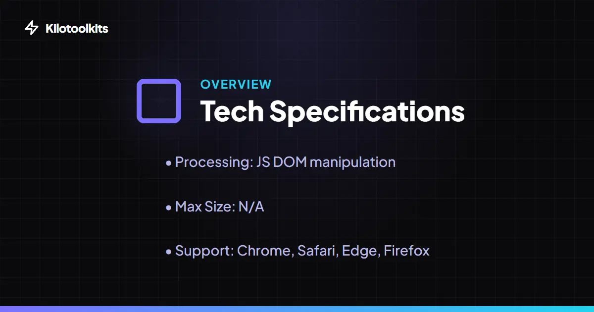
Tech Specs & Security
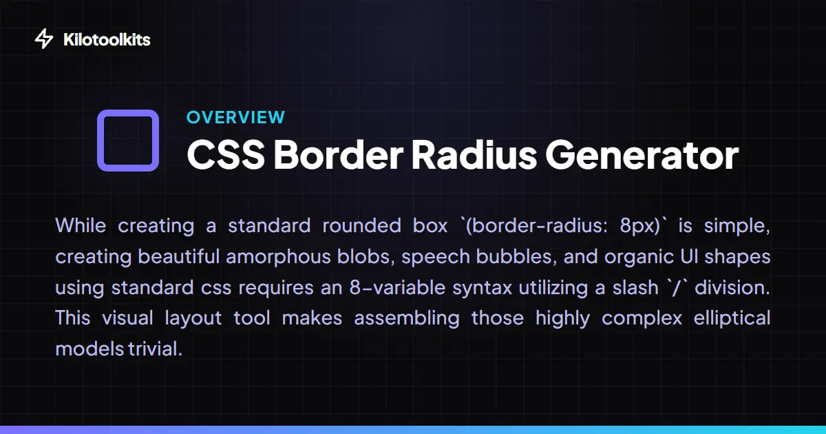
What is the CSS Border Radius Generator?
CSS Border Radius Generator is a high-precision design utility that moves far beyond simple rounded corners. While most designers stick to basic pixel values, CSS Border Radius Generator unlocks the 'Secret Sauce' of modern web aesthetics: the 8-value syntax. By separating horizontal and vertical radii for every corner, CSS Border Radius Generator allows you to create amorphous blobs, organic liquid shapes, and sophisticated asymmetrical buttons that feel natural and fluid. Every calculation happens 100% locally in your browser, ensuring your design experiments remain private and your workflow stays uninterrupted.
Mastering the 8-Value "Fancy" Mode
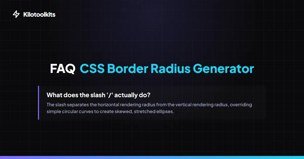
The core of CSS Border Radius Generator is its specialized 8-Value Fancy Mode. Standard border-radius uses circular arcs, but the 8-value syntax—represented by a slash (/) in your CSS—defines elliptical curves. This means you can have a corner that is broad on the top but sharp on the side. CSS Border Radius Generator provides independent sliders for all eight constraints, giving you the power to sculpt 'Squircle' shapes and organic UI elements that distinguish your brand from the millions of generic, perfectly circular layouts.
Animated Blob @keyframes Engine
CSS Border Radius Generator isn't just for static designs. It features a built-in Animated Blob Generator that morphs between two complex border-radius states. By generating a custom @keyframes block, CSS Border Radius Generator allows you to add high-end, 'liquid' background elements to your landing pages that shift and pulse smoothly. This killer feature is a favorite for modern SaaS sites looking to add subtle micro-interactions that wow the user without the heavy performance cost of video or SVG animations.
Units, Aspects, and Shorthand Optimization
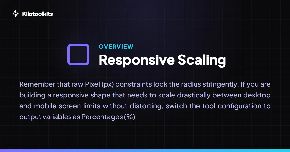
Precision is everything in UI development. CSS Border Radius Generator allows you to switch instantly between Pixels (px) for precise button styling and Percentages (%) for responsive blobs that scale with their container. To help you see your design in context, CSS Border Radius Generator includes an Aspect Ratio Switcher (1:1, 4:3, 3:4) and a Content Clipping Preview. Finally, the tool's Shorthand Optimizer automatically cleans your code, detecting identical corners and outputting the shortest possible CSS string for a lighter, more professional stylesheet.
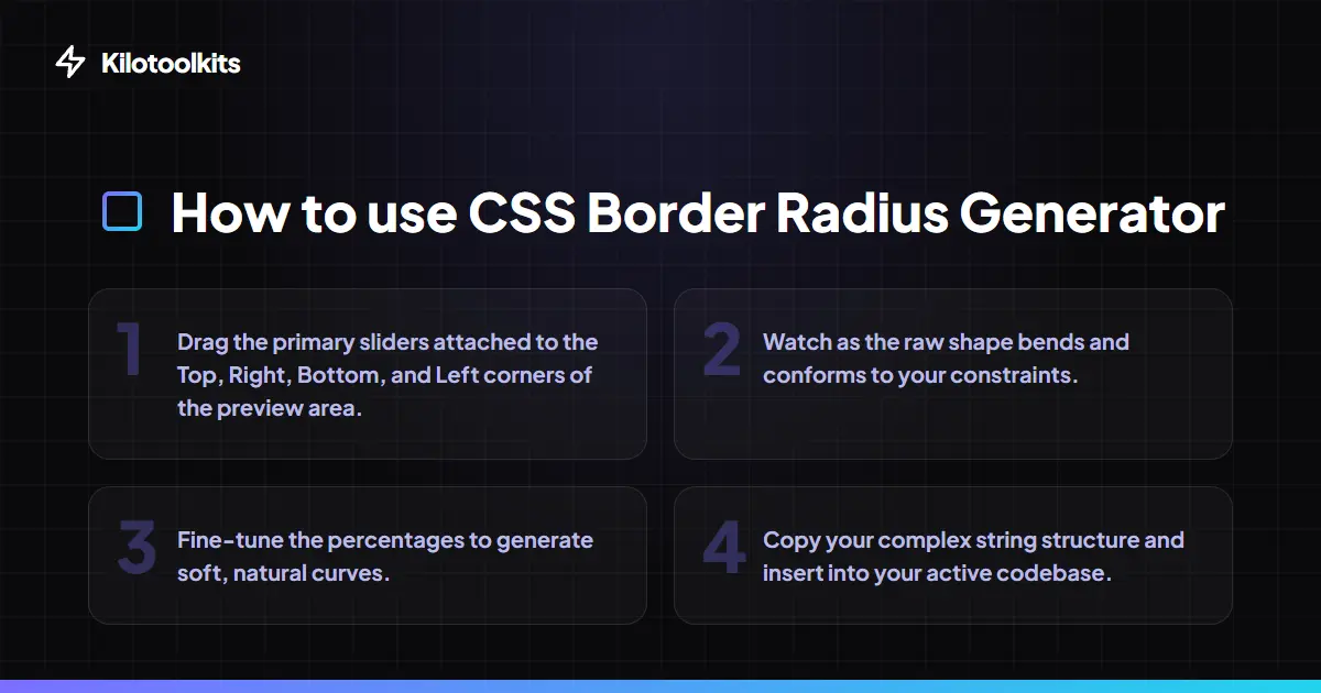
How to Use the CSS Border Radius Generator
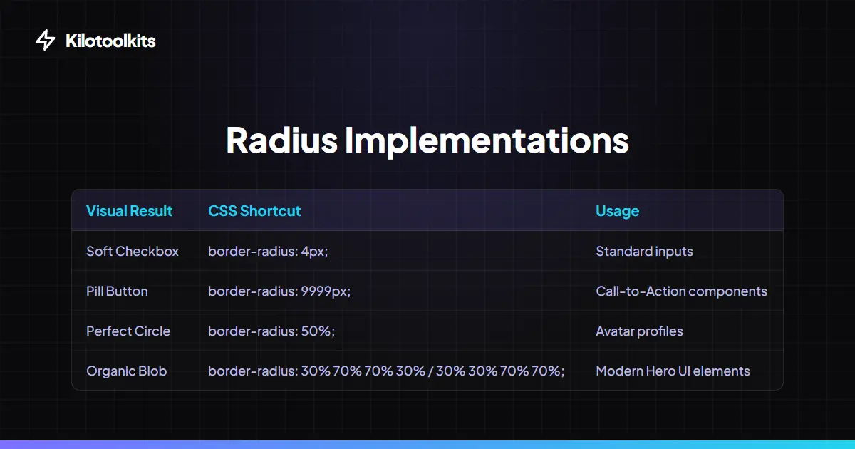
Radius Styles Compared
| Style | CSS Syntax | Best For | ||
|---|---|---|---|---|
| Rounded Card | border-radius: 8px; | App UI | Forms | Buttons |
| Pill / Capsule | border-radius: 999px; | Call-To-Action buttons | Chips | |
| Perfect Circle | border-radius: 50%; | Avatar profiles | Icons | |
| Fancy Blob | 8-Value Syntax (with /) | Hero backgrounds | Art elements | |
| Leaf Shape | Asymmetric corners (0% vs 100%) | Branding | Abstract markers |
Design Precision & Compatibility
CSS Border Radius Generator prevents common design mistakes by validating all percentage and pixel inputs in real-time. If your shape appears distorted on small screens, switch from 'px' to '%' to ensure the radius scales proportionally with the element. CSS Border Radius Generator also handles the 'overflow: hidden' context—our preview tool includes a toggle to see how content like graphics or background textures will clip against your custom radius, ensuring your design works in a real-world frontend environment.
Frequently Asked Questions
Tool Layout Gallery
Swipe to view more layouts